 +1 (774)478-6704
 Order@premiumonebackdrops.com


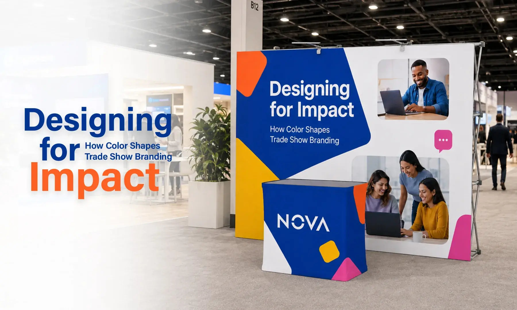
On a busy trade show floor, visitors often notice color before they read a full headline. A strong color system can guide attention, support brand recognition, and make the main message easier to understand from the aisle.
But effective booth color is not about choosing the brightest shade or following a short-term trend. The palette needs to work with your logo, industry, audience, message, display size, and the lighting inside the venue.
This guide explains how to use color psychology, contrast, and booth scale more effectively when designing printed trade show graphics.
If you are preparing a new display, explore our Pop Up Display collection for custom printed display options.
Why Color Matters on a Trade Show Floor
Visitors often make a quick visual judgment before they stop to read. They may first notice the dominant color, the contrast of the headline, the logo, and the strongest image.
A useful color system usually has a clear order: one dominant color creates the overall look, one supporting color helps organize the design, and a limited accent color highlights a call to action, product, or key message.
Use Color Psychology as a Guide, Not a Rule
Color can influence how people describe a brand, but no color creates one guaranteed reaction. Shade, brightness, surrounding colors, culture, personal experience, and industry expectations all affect how a color is perceived.
Research published in the Journal of the Academy of Marketing Science found that color can influence perceptions of brand personality. For exhibitors, the practical lesson is simple: choose colors that support the qualities your brand already wants to communicate rather than relying on a universal color formula.
Read the research on color and brand personality.
Red: Energy and Action
Red can create strong visual emphasis. It often works well for product launches, demonstrations, promotional messages, or calls to action. Because it carries a lot of visual weight, red is often easier to control as an accent than as the only color across a large booth.
Blue: Stable and Professional
Blue is common in corporate, technology, finance, healthcare, and professional services. It can support a calm, established look, but many B2B brands already use blue. Strong contrast, photography, typography, or a distinctive secondary color may still be needed to make the booth recognizable.
Green: Growth, Health, and Sustainability
Green can fit healthcare, wellness, agriculture, environmental, and sustainability-focused brands. Darker greens may feel more established, while lighter greens can feel fresher. The exact shade should still match the brand rather than being chosen only because a campaign mentions sustainability.
Yellow: Attention and Optimism
Yellow can draw attention quickly and works well for small highlights, directional information, or calls to action. Large areas of bright yellow can become tiring, and light text can disappear against it. Pair it with a darker color when readability matters.

Contrast Matters More Than Brightness
A color combination may look attractive on a laptop but become difficult to read when printed across a large backdrop. Trade show graphics are viewed from different distances and under mixed venue lighting, so the main message needs clear separation from the background.
Dark blue text on medium blue, pale gray on white, or yellow text over a light photograph may look subtle on screen but lose clarity from across the aisle.
The World Wide Web Consortium provides contrast guidance for digital content. These rules are not print specifications, but they are a useful reminder that two colors can be different without creating enough visual separation.
Review the W3C guidance on minimum visual contrast.
For trade show graphics, use strong contrast for the logo, headline, and main call to action. Keep important text away from busy photography, and use a solid panel behind copy when the image underneath makes reading difficult.

How Booth Size Changes Color Strategy
The same palette can behave differently on a 10ft display and a 20ft booth. As the graphic becomes larger, the amount and placement of each color also becomes more noticeable.
For a 10ft Display
A 10ft display has a more concentrated viewing area. One dominant color, one clear headline, and one strong focal image are often enough. Too many small color blocks can make the backdrop feel crowded and weaken the main message.
Give the logo and headline most of the visual weight. Supporting information should remain secondary.
For a 20ft Booth
A 20ft booth provides more room, but simply stretching a 10ft design across twice the width is rarely the best solution. A larger booth can use coordinated color zones for different products, services, or visitor activities while keeping the same brand colors and typography across the full space.
The goal is to create separate areas without making the booth look like several unrelated designs placed next to each other.

Keep the Brand Recognizable
Trade show graphics should feel fresh without making the brand look unfamiliar. Changing the main logo color or replacing the entire brand palette for one event can weaken consistency with the website, packaging, social media, and other marketing materials.
A safer approach is to keep core elements consistent and use flexible elements for each campaign.
- Keep consistent: logo colors, primary typography, logo proportions, and overall brand personality.
- Use more flexibly: accent colors, background shapes, gradients, photography, and event-specific highlights.
Audience expectations matter too. A medical brand may use a calmer palette, while a product launch may support stronger accents. The important point is that the final design still feels like the same company.
Remember That Screen Color and Printed Color Are Different
A monitor creates color with light, while printed fabric is viewed through reflected light. Screen settings, fabric, ink, color profiles, and venue lighting can all affect the final appearance.
That means a bright screen color may look less luminous after printing, and the same printed graphic may look slightly different under daylight, warm indoor lighting, or exhibition hall lighting.
Before production:
- Use approved brand color values when available
- Review the final production artwork, not only a browser preview
- Check that logos and images use the intended colors
- Be careful with very pale or very dark combinations
- Request a printed sample when close color matching is important and sampling is available
Check the Artwork Before Printing
Color and readability problems are much easier to fix before production. Before approving the final artwork, review the complete graphic rather than judging individual colors by themselves.
- Confirm that the design follows the approved brand palette
- Check that the logo and headline remain clear at a smaller preview size
- Review the artwork from the expected viewing distance
- Keep important information away from edges and seams
- Make sure people standing in front will not block key content
- Confirm that logos and product images are clear enough for the final print size
Brands that need new or replacement graphics can contact the POB team for help reviewing a display before production.
Frequently Asked Questions
Do I need to change my brand colors to attract more attention?
Usually, no. Start with the established brand palette and improve visibility through contrast, spacing, image scale, and a controlled accent color. A new accent can refresh an event campaign without replacing the main identity.
How many colors should a trade show booth use?
There is no fixed number, but the design should have a clear order. One dominant color, one supporting color, and a limited accent are often easier to control than several equally strong colors competing for attention.
Should I use a dark or light background?
Both can work. Dark backgrounds need bright, readable text, while light backgrounds usually need darker type and enough separation from the surrounding hall. Choose based on your brand, photography, and venue lighting.
What if my brand colors have low contrast?
Keep the official colors, but use neutral backgrounds, white space, darker text, or solid panels behind important information. The goal is to improve readability without changing the identity of the brand.
Will the printed color look exactly like my screen?
Not necessarily. Screens and printed fabric reproduce color differently. Use approved color values, review the final artwork carefully, and request a printed sample when close matching is important.
Make Color Work for Your Brand
Color psychology is most useful when it supports a clear brand message rather than replacing one. A strong trade show graphic combines recognizable brand colors, readable contrast, clear hierarchy, and a layout that works at the actual size of the booth.
Use color to guide attention, not to make every part of the display compete. Review the full artwork at the expected viewing distance and consider how the palette will look on printed fabric under real event lighting.
Browse our Pop Up Display collection or contact our design team for help preparing booth graphics for your next event.