 +1 (774)478-6704
 Order@premiumonebackdrops.com


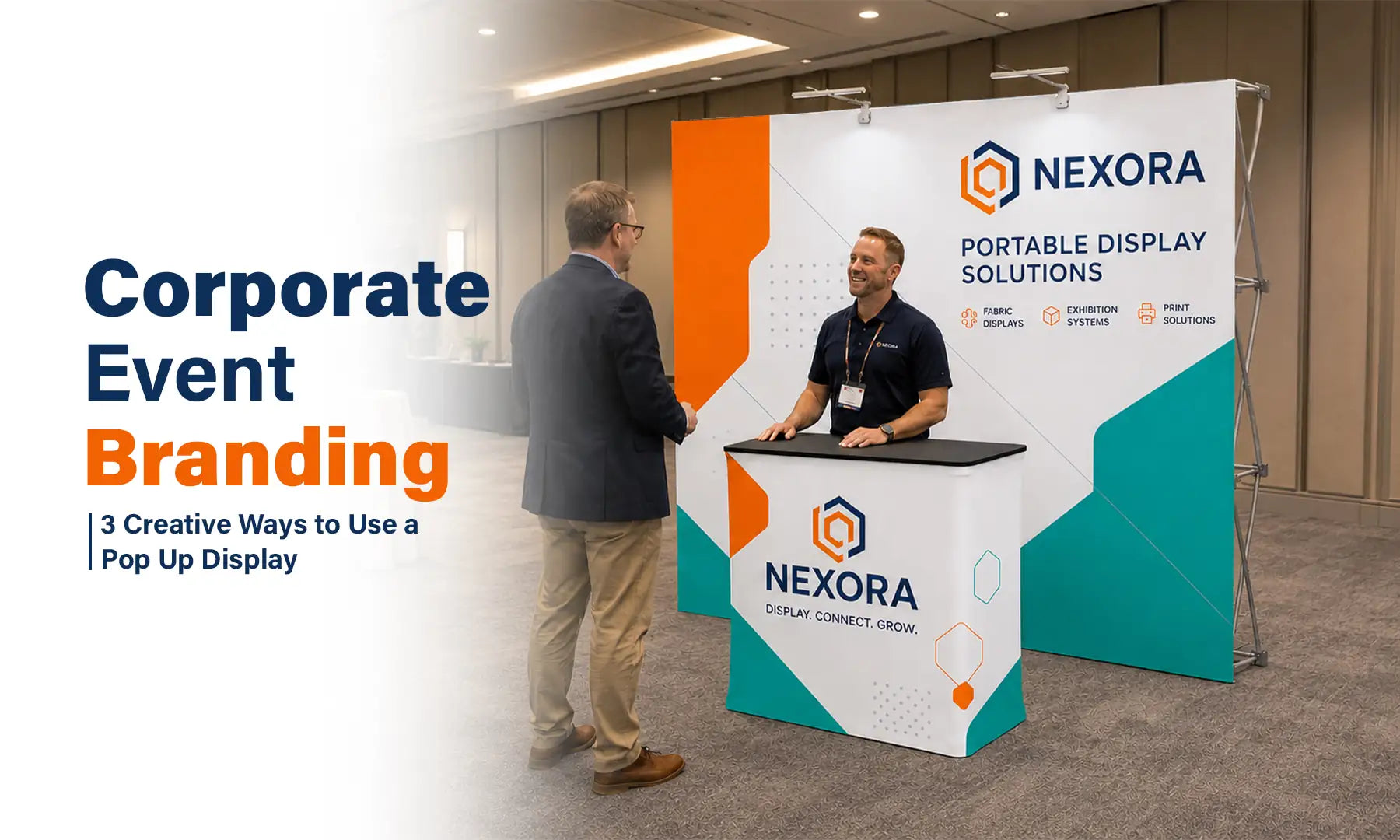
Corporate events are important opportunities to strengthen customer relationships, align internal teams, introduce new ideas, and present a consistent brand image. However, the event environment should feel professional without becoming overly formal, visually crowded, or difficult for the event team to manage.
A Pop Up Display can serve as more than a temporary background. With focused artwork, it can become a portable brand statement, a clear information point, or the visual anchor for an interactive corporate event area.
The following three corporate event branding ideas show how the same display format can support annual meetings, industry conferences, and company pop-up shops while keeping the visual identity consistent.

Idea 1: Create a Brand Statement Wall for Annual Meetings
An annual meeting brings employees, executives, partners, or stakeholders into one shared environment. The main backdrop should reinforce the organization’s identity while supporting presentations, professional photography, and networking.
A Straight Fabric Pop Up Display works well as a central brand statement wall because its flat graphic surface provides a clear area for the company logo, annual theme, campaign message, or meeting title.
Keep the Message Focused
Avoid filling the backdrop with detailed agendas, long company descriptions, multiple campaign statements, or every department logo. A more professional annual meeting layout usually includes:
- The corporate logo in a highly visible position
- One annual meeting theme or headline
- The event year or location when relevant
- A restrained background pattern based on the brand identity
- Enough open space for individual and group photography
The main purpose of the graphic is to establish the event identity quickly. Detailed schedules, speaker information, and session descriptions can be shared through event programs, email communications, presentation slides, or a dedicated landing page.
Design with Event Photography in Mind
The backdrop may appear in leadership photos, team pictures, internal communications, recruitment materials, and social media posts after the meeting. Important logos and event titles should therefore be positioned high enough to remain visible when people stand in front of the display.
Avoid placing essential text near the bottom of the graphic, where it may be blocked by attendees. Leave enough open space around the main logo so the final photographs do not look crowded.
Before the event begins, review the display from the position where photographs will be taken. Check that the logo remains visible behind both individuals and larger groups and that the backdrop is positioned straight within the room.
Freeman’s event design guidance explains that design choices should support the way people move, pause, communicate, and connect within an event environment. This reinforces the importance of planning the backdrop around the experience taking place in front of it rather than treating it as decoration alone.
Read Freeman’s Small Booth, Big Impact Part 2: Smart Exhibit Design Choices for additional event design guidance.
Idea 2: Build a Professional Information Hub for Conferences
At an industry conference, attendees are often looking for a quick explanation of what a company does, who they should speak with, and what action they should take next. A Pop Up Display can organize this information into one clear visual area without turning the backdrop into a product catalog.
The graphic should establish the company identity from a distance and then provide a simple next step when visitors move closer.
Use the Backdrop for Recognition, Not Every Detail
Visitors walking through a conference venue may only look at the display for a few seconds. They should be able to recognize the organization and understand its primary message without reading several paragraphs of text.
A practical conference graphic may include:
- The company logo in the upper viewing area
- One short statement explaining the core service or event message
- A clear product, service, or campaign image
- A QR code linked to a conference landing page or downloadable resource
- A brief call to action such as “Book a Demo,” “View the Report,” or “Learn More”
- Enough negative space to keep the design readable from the aisle
The QR code should be large enough to scan comfortably and placed where it will not be blocked by people standing in front of the display. Use a short supporting instruction so attendees understand what they will receive after scanning.
For example, “Scan to Download the Industry Report” is more useful than displaying a QR code without context.
Create a Clear Information Hierarchy
Arrange the graphic so the visitor sees the information in a logical order:
- Company identity
- Core message
- Supporting image or benefit
- Call to action
This approach allows the backdrop to function as a professional information point without forcing every product feature, speaker detail, or company service onto one graphic.
The large fabric printing area also helps the company maintain consistent logo proportions, brand colors, typography, and campaign messaging when attending conferences in different locations.

Idea 3: Create an Interactive Visual Backdrop for Brand Pop-Up Shops
A company pop-up shop needs to do more than display a logo. The temporary space should encourage visitors to approach, discover a product, take a photograph, scan for more information, or speak with a company representative.
The Pop Up Display provides the main visual background, while the artwork directs visitors toward one clear action.
Design Around One Visitor Action
Start by deciding what visitors should do when they reach the display. The primary action may be to:
- Discover or test a new product
- Scan a QR code for an offer or additional information
- Take a branded photograph
- Watch a product demonstration
- Speak with a company representative
The graphic should support that action rather than compete with it.
For example, a product launch backdrop may use one large product image, one short benefit statement, and a QR code. A branded photography area may use a repeating logo pattern or a centered company statement that remains visible behind visitors.
Avoid placing several unrelated calls to action on the same graphic. Asking visitors to scan, subscribe, register, purchase, follow multiple social accounts, and download a brochure at the same time can make the experience less clear.
Keep the Campaign Identity Consistent
Use the same brand colors, logo treatment, typography, and campaign language across the Pop Up Display, promotional emails, digital landing pages, event invitations, and social media content.
This consistency helps a temporary activation feel like part of a complete corporate campaign rather than an isolated event.
Freeman notes that strong visual choices can help attract attention and communicate the brand story before attendees begin reading detailed information. Large-scale imagery, high contrast, clear color choices, and readable messages can help a smaller event space create a stronger first impression.
View Freeman’s Small Booth, Big Impact Part 1: Easy Visuals That Pop for additional guidance on using graphics and visual identity to attract attendees.

Why Choose Pop Up Displays for B2B Events?
Corporate event displays need to support a professional brand image without creating unnecessary work for the event team. Pop up displays are particularly useful because they combine a large custom graphic area with a collapsible and reusable structure.
Faster Event Preparation
A collapsible frame reduces the number of separate structural components that must be assembled. This can make the setup process more manageable for internal marketing teams, event coordinators, and smaller companies that handle their own event preparation.
The team should still complete a practice setup before the event, confirm the graphic orientation, and review how the frame should be collapsed and packed afterward.
Consistent Brand Presentation
The same corporate colors, typography, logo standards, and message hierarchy can be applied across the backdrop artwork, digital event materials, invitations, presentation slides, and campaign communications.
This helps maintain a recognizable corporate identity even when meetings and events take place in different venues.
Reusable Across Different Event Types
The reusable frame can support different corporate applications throughout the year. A company may use the display for an annual meeting and then order a replacement graphic for the same model and size when the campaign changes.
This allows the same display structure to support conferences, product launches, recruiting events, internal meetings, and temporary promotional spaces without requiring an entirely new frame for every event.
A More Organized Visitor Experience
A focused graphic helps visitors understand where to look and what action to take. Clear logo placement, one central message, and a simple call to action can make the event area easier to understand without overcrowding the backdrop.
Three Planning Questions Before the Event
1. How Much Information Should Go on the Backdrop?
Keep the backdrop focused on the brand and the primary event message. Detailed schedules, technical explanations, long service lists, and speaker information are usually better placed in event programs, presentation slides, landing pages, or follow-up materials.
Ask whether each element helps a visitor recognize the brand or understand the main message. If it does not support either purpose, it may not need to appear on the backdrop.
2. Where Will Attendees View the Display From?
Consider whether attendees will see the display from directly in front, from an aisle, or while standing several feet away. The expected viewing position should influence logo size, headline length, image scale, and QR-code placement.
Important information should remain visible when people stand in front of the graphic. Avoid placing the main logo, event title, or call to action in areas that are likely to be blocked during conversations or photography.
3. Can the Same Display Work for Several Corporate Events?
Yes, provided the frame size and format suit each environment.
A flexible corporate graphic can be used for general company events, while replacement graphics can be ordered when the campaign, annual theme, or product message changes. Keeping the logo position and core visual identity consistent helps the display remain recognizable across different applications.
Frequently Asked Questions
What Size Pop Up Display Works Best for a Corporate Event?
The appropriate size depends on the venue, available wall space, viewing distance, and the number of people likely to stand in front of the display.
A smaller format may work well for registration areas, recruiting events, or compact conference spaces. A wider display may be more suitable for annual meetings, branded photography, product launches, or event areas where several people need to stand in front of the graphic.
Review the available floor plan and finished display dimensions before ordering rather than choosing a size based only on the appearance of a product photo.
Can One Pop Up Display Be Used for Different Corporate Events?
Yes. A reusable frame can support annual meetings, conferences, recruiting events, product presentations, internal meetings, and temporary brand activations when the size and format suit each venue.
A general corporate graphic may be reused across several events. When the campaign message changes, a compatible replacement graphic can be produced for the same frame model and dimensions.
How Much Text Should Be Included on a Corporate Event Backdrop?
Keep the text limited to the company identity, one primary message, and one clear next step. Long service descriptions, detailed agendas, speaker biographies, and technical information are usually difficult to read from an aisle or across a conference room.
Use event programs, presentation slides, landing pages, or follow-up materials for detailed information. The backdrop should help attendees recognize the organization and understand the main purpose of the event area quickly.
Where Should the Logo and QR Code Be Placed?
Place the main logo in an upper or central viewing area where it will remain visible when people stand in front of the display. Avoid positioning essential branding near the bottom edge, where it may be blocked during conversations or photography.
A QR code should be large enough to scan from a comfortable distance and placed where attendees can approach it without interrupting other visitors. Include a short instruction such as “Scan to Book a Demo” or “Scan to View the Event Guide” so users know what will happen after scanning.
Is a Straight Fabric Pop Up Display Suitable for Corporate Photography?
Yes. A Straight Fabric Pop Up Display provides a flat graphic surface that can work well for leadership photos, team photographs, speaker interviews, and corporate event content.
For better results, keep important logos above waist height, leave enough open space around the main message, and review the camera position before the event begins. The backdrop should also be wide enough for the expected number of people in each photograph.
Turn a Portable Backdrop into a Corporate Brand Tool
A Pop Up Display does not need to be limited to a traditional trade show booth. With focused artwork, it can serve as a brand statement wall, a professional conference information point, or the visual anchor for an interactive brand activation.
The strongest corporate displays are not necessarily the busiest. They use clear branding, deliberate spacing, and a layout designed around what attendees should see, understand, and do.
Ready to strengthen your corporate event branding? Browse the professional Pop Up Display collection or request a custom quote based on your event type, venue, display size, and presentation goals.